
Designing for Speed without Losing Trust
- Jun 3
- 3 min read
Updated: Jun 17
Following the Roomba Home 2.0 release, our teams in the US and China have been working together to rebuild much of the Roomba Home experience in Flutter. While most of that work supports investments in personalization and adaptive cleaning, it also gave us room to revisit some of the product's most common interactions - one of those was Quick Starts.
What started as a relatively small interaction change became an interesting lesson in user trust, speed, and how different teams can approach the same problem differently.

Role: Product Design Manager, iRobot
Team: Cross-functional design team across US and China
Skills: UX strategy, interaction design, user research synthesis, cross-functional collaboration Deliverables: Quick Start enhancements (Planned July 2026 release)
CONTEXT
Quick Starts were originally created to help people launch common cleaning routines without rebuilding their selections every time. The feature quickly became one of the most-used entry points in the app - in production, over 60% of cleaning routines were started through a Quick Start. That number confirmed something we'd heard repeatedly in research: most people don't want to make the same decisions every time they open the app.
As we continued refining the experience, we started questioning whether the review step was still earning its place. At the time, tapping a Quick Start opened a pre populated Routine Builder screen where users could preview the routine, make edits, or cancel before anything started. The proposed change removed that step entirely enabling users to tap once and start cleaning.
On paper, it looked like a small optimization, but to me, it felt like a meaningful shift in where users retained control.
DIFFERENT INSTINCTS, SAME GOAL
Nobody on the team disagreed about what we were trying to achieve. We all wanted cleaning to feel faster and as low lift as possible. The difference was in where we thought users should have an opportunity to stop.
My concern wasn't that users wouldn't understand the interaction, it was accidental activation. Tapping the wrong Quick Start sends a robot to move around your home.
Others on the team felt strongly that the review screen was unnecessary friction for a behavior users had already committed to. If someone took the time to set up a Quick Start, why ask them to confirm that decision every single time? This pattern also shows up in competitor apps, which wasn't a signal we wanted to ignore.
The question was what users actually wanted, and we didn't have real evidence either way.
VALIDATING THE CHANGE
Rather than continuing to debate, or design for a middle ground, we included the change in a broader alpha release and monitored feedback across hundreds of users.
The results pushed back on some of my assumptions. Alpha users were more successful completing cleaning tasks with the streamlined flow, and satisfaction scores for starting a cleaning routine jumped from 3.70 to 4.28.
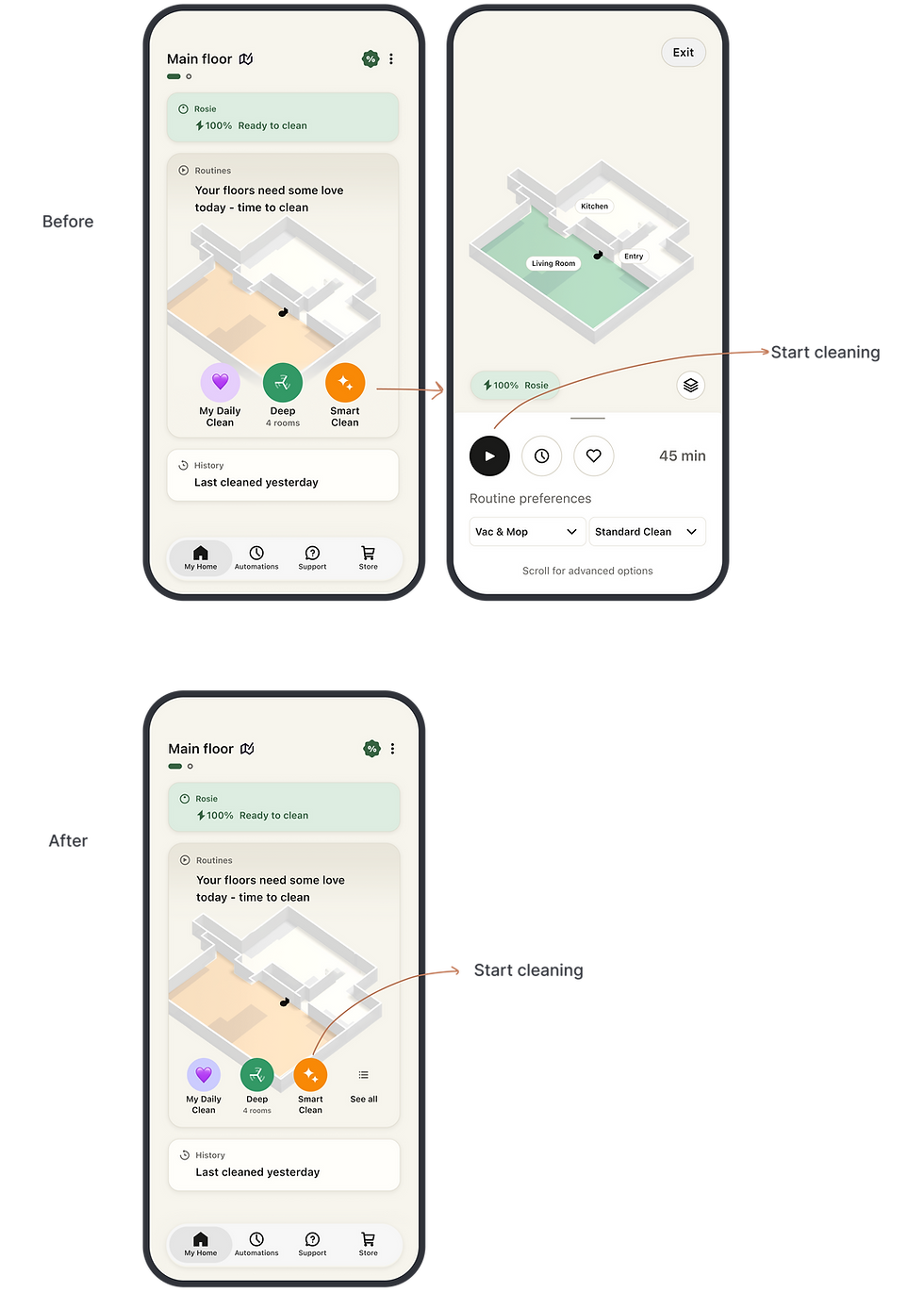
More surprising than the numbers was how little users seemed to miss the review step. For a behavior people perform repeatedly, speed mattered more than the additional confirmation.
That finding reinforced a recurring pattern I see over and over with automated experiences: once users trust the outcome, they want fewer decisions in their way, not more.
COLLABORATING ACROSS TEAMS
This project is also a good example of how our US and China teams work together as we rebuild portions of the experience in Flutter. We're constantly evaluating competitors, revisiting older assumptions, and surfacing opportunities to improve core workflows - and different perspectives naturally come with that.
Some of the most useful discussions we've had started with genuine disagreement about what users need. In this case, I found myself pushing for confidence and recoverability while others pushed for immediacy and reduced friction. A seemingly simple interaction became a larger conversation about trust, efficiency, and how much control users actually require.
The alpha results helped us move beyond opinions and understand which tradeoff users actually preferred.
REFLECTIONS
What I find most interesting is that the user feedback reframed the next challenge for us. Instead of asking how many safeguards users need before starting to clean, we started asking how can we help users recover from a mistake. That's a much more interesting design question, and one we're continuing to explore through ideas like countdown to start and undo actions.