
Roomba Home 2.0: Leading a User-Driven App Release
- Feb 17
- 6 min read
Updated: Jun 17
We made a major update to the Roomba Home app that brought together navigation, reliability, and repeat behaviors into a cohesive, user-driven release. This work focused on turning long-standing themes from user feedback into clear, everyday experiences that scale.

Role: Product Design Manager, iRobot
Team: User Testing Lead, 2 designers, 1 writer
Tools: Figma, Figma Make, Lovable, Copilot, Usertesting.com
Skills: UX strategy, User research synthesis, Cross-functional collaboration
Deliverables: Roomba Home 2.0, a major, multi-feature release (shipped February 2026)
CONTEXT
By 2026, feedback from alpha testers, customer care, and app reviews were consistent. Users weren’t sure where to start cleaning, struggled to make sense of robot errors, and asked for easier ways to reuse the same cleaning routines
At the same time, the Home tab had lost its purpose. Though it was the landing page, over time it had been reduced to little more than a map selector. It didn’t help users understand what was happening in their home or what to do next.
These updates were very intertwined and highly dependent on each other, but shipping them all together risked changing too much at once for our existing users.
This was my first time owning both delivery and direction at this scale. The challenge wasn’t designing individual features, it was turning months of feedback into a simple, reliable experience people could trust day to day.
REDEFINING THE HOME TAB
The Home tab was the most visible part of the app, and also the least defined.

Feedback made a few things clear: The Home and Robots tabs felt duplicative, and users often weren’t sure where to go to start cleaning. Neither tab was clearly doing its job, which made the app harder to understand than it needed to be.
We know most users think about their robot as part of their home, not as a separate thing to manage. Having a separate Robots tab didn’t match that mental model and added to the confusion. What wasn’t clear at first was how much the Home tab actually needed to change to fix this.
SCOPING CHALLENGES
For nearly two months, the Home tab work moved back and forth without clear momentum. The designer leading this work was looking for clearer boundaries around what to deliver and sharing ideas that ranged from vision to quick fix.
When they started this work earlier in the year, I was not managing them directly, so I joined partway through their exploration. I assumed they wanted more freedom to explore and propose solutions. I underestimated how much guidance was needed, which contributed to continued misalignment. We'd look at easy-for-engineering, low impact incremental improvements, entire overhauls and everything in between.

The result was confusion around what success looked like and what level of scope and fidelity was expected. This became an important learning moment for me.
I realized that an open problem at the center of the app required clearer framing, not looser constraints. I stepped back and explicitly defined the Home tab as a home dashboard rather than a container for every feature. I anchored it around three responsibilities: current state (What’s going on in my home now?), next action (What should I do about it?), and quick access to cleaning, always.
That definition gave the designer clear boundaries to work within and allowed the team to move forward with confidence.
As a new manager, this moment reshaped how I approached scoping for the rest of the release. I became more intentional about setting constraints up front and tailoring the level of ambiguity to each designer’s experience.
That shift prevented similar confusion later and helped the broader App 2.0 work move faster and with more clarity.
DECISION-SHAPING INSIGHTS FROM USER FEEDBACK
Users wanted immediate access to cleaning. Most users didn’t want to configure a routine every time they needed to clean. They wanted to open the app and start. 44% of routines were started in production using a Quick Start routine, which led us to elevate these shortcuts on the Home tab removing unnecessary steps.
Users struggled to understand robot failures. Errors felt abrupt and stressful because, despite severity, they were all treated the same way. We introduced a clear error hierarchy, separating non-blocking states from critical failures.
Users repeatedly asked for saved routines (favorites). Feedback going back to the earliest releases constantly asked for creating custom saved routines (favorites) to make repeat cleaning easier and more personal. This led us to launch this feature as soon as the foundational experience was solid.
HOW I MANAGED THE WORK
Setting Clear Experience Goals
To keep a broad, interconnected release aligned, I worked with my team to establish a small set of shared experience principles grounded in user feedback:
Help users understand what’s happening in their home before asking them to act
Make robot state clear and easy to interpret
Reduce effort for primary or repeat behaviors
Personalize without adding complexity
These gave the team a common lens for decision-making and helped keep design, product, and marketing aligned as the work evolved.
Coordinating Dependencies and Scope
Because many of the features touched the same core flows, active dependency management was critical.
For example:
Elevating Quick Starts first required clarifying the Home tab’s role and design
Troubleshooting needed to be accessible within the updated navigation
History access had to be restored after earlier visual changes buried it
Managing these connections intentionally prevented fragmentation at launch and helped the release feel cohesive rather than piecemeal.
BRINGING IT ALL TOGETHER: WHAT WE SHIPPED
Roomba Home 2.0 shipped in February 2026. This release wasn’t about just adding more functionality. It was about making the core experience easier to understand, faster to use, and more consistent day to day. Across the Home tab, error handling, and saved favorites, the goal was the same: reduce friction, make system state clear, and support the ways people already clean their homes.
Introducing the Experience to Existing Users
To ensure a smooth transition, we introduced the update with a short, guided walkthrough at launch, helping existing users quickly understand what’s changed before they enter the app.

A Clear Home Base
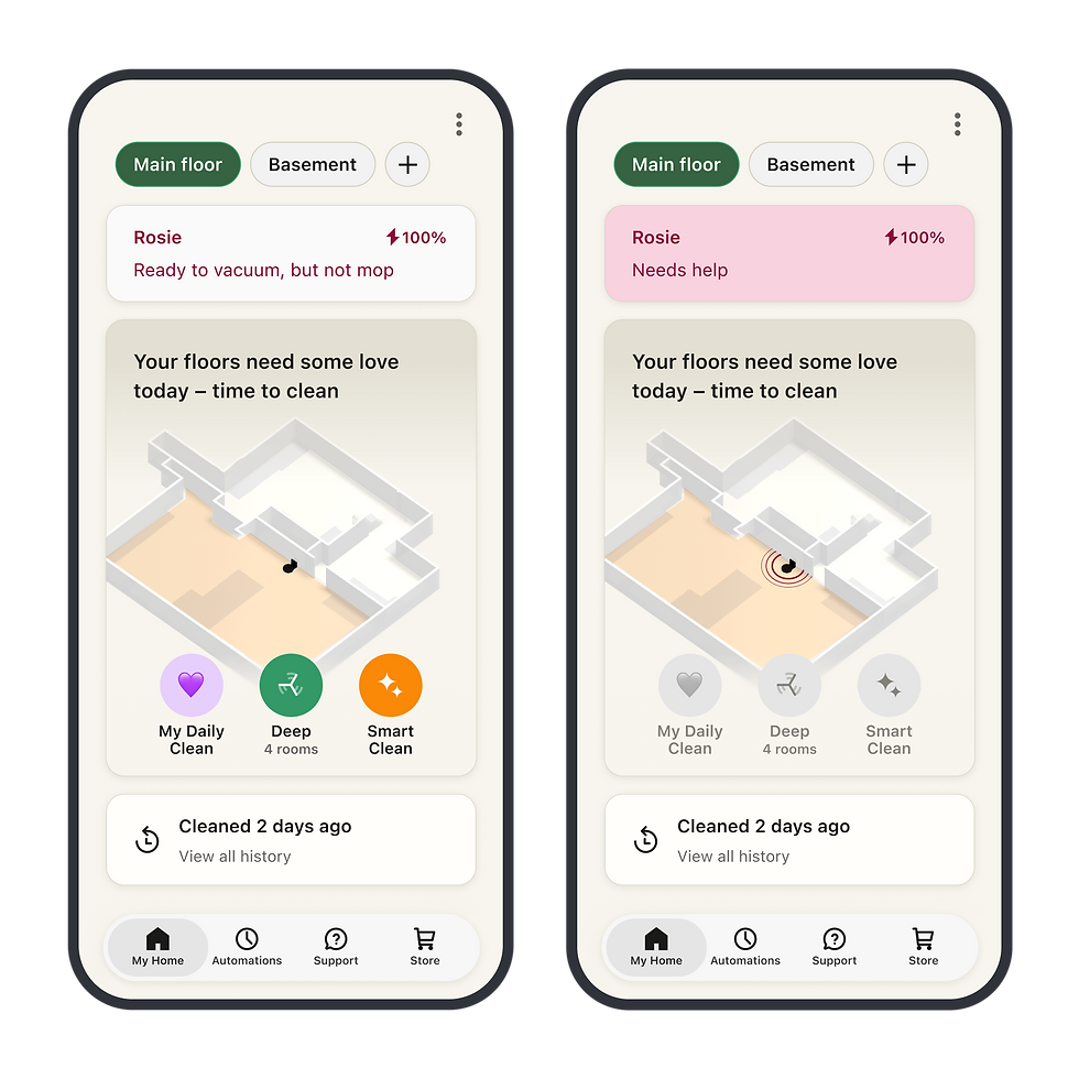
The Home tab became a true home hub. It provides an at-a-glance view of the home and robots while making it quick and easy to start cleaning without digging through the app.

Error Hierarchy that Makes Sense
Robot state is now easier to understand, especially when something goes wrong. We clarified the difference between minor issues and real failures and surfaced access to help directly on the Home tab (versus isolated on the robots tab so users aren’t left guessing).
Personalized, Routine Cleaning
Saved routines give users a simple way to reuse the routines they run most often. Custom names and emojis add a lightweight layer of personality, helping people recognize and feel ownership over their routines. By preserving intent across sessions, repeat cleaning no longer requires starting from scratch.

IMPACT
More users adopted Quick Starts for repeated cleaning
Following the launch of Roomba Home 2.0, Quick Start usage increased from 44% to over 60%. By surfacing routines directly on the Home tab and reducing the steps required to start cleaning, more users adopted repeatable cleaning behaviors instead of configuring each routine individually.
User feedback shifted toward workflows and enhancements
As usability and reliability improved, user feedback increasingly focused on workflow improvements, feature requests, and ways to personalize the experience. Rather than struggling to complete core tasks, customers were now focused on getting more value from the product.
We solidified the foundation for future experiences
Roomba Home became the central place where customers could discover, launch, and manage their cleaning routines. The interaction patterns introduced in Home 2.0 established a foundation for favorites, recommendations, automation, and future investments in intelligent cleaning experiences.
REFLECTIONS
Clear scope unlocked progress On central parts of the app, ambiguity slows everything down. Once I defined clear boundaries for what the Home tab was responsible for, and what it wasn’t, the work moved faster and with far more confidence.
Making and holding tradeoffs is part of design leadership Owning direction meant deciding what not to solve in 2.0. Treating the release as a foundation rather than a catch-all was essential to shipping something coherent and setting the team up for what came next.
WHAT'S NEXT?
Building on 2.0, the focus shifts to guidance, intelligence, and deeper personalization. With the Home tab now acting as a true home hub, the app can move beyond basic control and toward helping users actively maintain their homes. Continuing to listen closely to how people use the app will guide what we build next as Roomba Home evolves into a true smart home experience that supports people day to day, not just when they press start.