
Once our engineers proved CIBO's back end capabilities with a beta product, I led the effort to bring complex analysis to users in a meaningful way.
Reimagining CIBO Land Reports
PROJECT OVERVIEW
In 2020, CIBO completed beta testing of our first product, CIBO Insights, validating our backend land simulation and analysis capabilities.
Working closely with our pilot test group, a research contractor, and head of engineering, I translated complex analysis into meaningful user insights through improved land reports.
I led user conversations, wireframed solutions, and created rapid prototypes to validate ideas with both users and engineers, culminating in a production release in early 2021.
This effort also included building out the first CIBO design system, establishing foundational components and patterns to enable scalable, consistent experiences across platforms while streamlining design and development workflows.
Today, the CIBO Land Report remains a foundational feature of CIBO's enterprise offerings, even as the company and product focus has evolved.
STATUS
Shipped, March 2021
CONTRIBUTION
Lead Product Designer
PRODUCT
CIBO Insights, 1st Production Release (Desktop App, Mobile App, iOS & Android)
AUDIENCE
Farmers, Land Owners, Land Buyers
SKILLS
UX Strategy & Design Systemming
Early Concepts & Close Collab with Dev
User Research & Interviews
Rapid Prototyping & Testing

CONTEXT
There is a lack of objective data in agriculture, making it challenging for farmers, land owners & investors to accurately assess the value, productivity, and environmental impact of land.
CIBO set out to solve this problem with our beta product, CIBO Insights.
THE PROBLEM
The goal of our beta release was to make CIBO's simulation technology accessible to an end user by translating complex science into simple land metrics, accessible from a friendly UI.
However, the beta report was not optimized for the user:
-
Relevant information was hard to find
-
Key takeaways were unclear
-
Overwhelming amount of information presented at once
-
Geospatial data was impactful, but hidden
Once the tech was up and running, our focus shifted to improving the user’s experience.

DISCOVERY
We conducted a card sort activity and a series of user interviews to better understand some basics about our users and to help inform our design decisions. Here are some key learnings:
What are your reasons for researching farmland?
Purchase Land (44.1%)
Sell or Lease Land (40.7%)
Rent or Operate Land (35.6%)
Other* (37.3%)
*Top write-in answers included: Land Valuation (Check value of my land and surrounding land, appraisals), Develop ROI profiles, Financing land, Check sales history.
Land Value
Productivity (Historic Performance / Yield)
Soil Types / Quality
Owner Information
Potential Yield / Improvements
**We also gathered information about priority insights for each type of user, however, we have not prioritized one group over the other, so overall insights took precedence.
REASSESSING IA BASED ON USER INSIGHTS
The beta architecture had 2 main report sections that were structured based on the science being run in the background and internal assumptions.

We completely pulled apart initial IA and reorganized our content into one report, made up of digestible sections, based on the information users prioritize most.*

*If you’re really paying attention here, you might notice in this diagram that “Environment” is prioritized first, when users actually ranked those metrics lower on the list. This was a case of competing business and user priorities, and a tradeoff was made in order to balance the two.
PROCESS: DESIGN IMPROVEMENTS
Highlight geospatial data with a split report & map view
-
The Good: Geospatial Data is primary & interactive; Overview groups information in a user-centric way
-
The Bad: Report space is minimized, leaving the user to scroll or click extra to get into land details they may actually care about


Do away with the overview section & add simple navigation
-
The Good: Information is grouped in a user-centric way; Navigation makes it clear that there is more to discover
-
The Bad: Adds another element to an already complex UI


PROCESS: WHAT ABOUT MOBILE?
I started these designs in a large viewport since the majority of our users access Insights on a computer. However, in our usability testing, we heard the occasional user may want to bring this with them them out into a field when visiting a property.
For that use case, they would likely be on a tablet or even a phone.


The first designs were very similar to the full size experience - however with this solution, the pairing between report and geospatial data was entirely lost.


The next iterations simplified the experience by putting the nav in the drawer. These were largely awkward and took up too much space for a small viewport, or crunched the report content into an already tiny space.


In the final UI, a user can navigate back and forth between report sections without seeing a full menu. They are cued to this functionality with icons at the top of the drawer and the end of each report section.
A NEW APPROACH TO UI
To support our new structure, I developed a new report navigation & UI, centered around an interactive map.
We had just released interactive map layers as part of our land search, so this seemed like a natural extension of that feature. Each section had corresponding, interactive geospatial data bringing the report to life.
These new designs also incorporated data limits based on user plan.
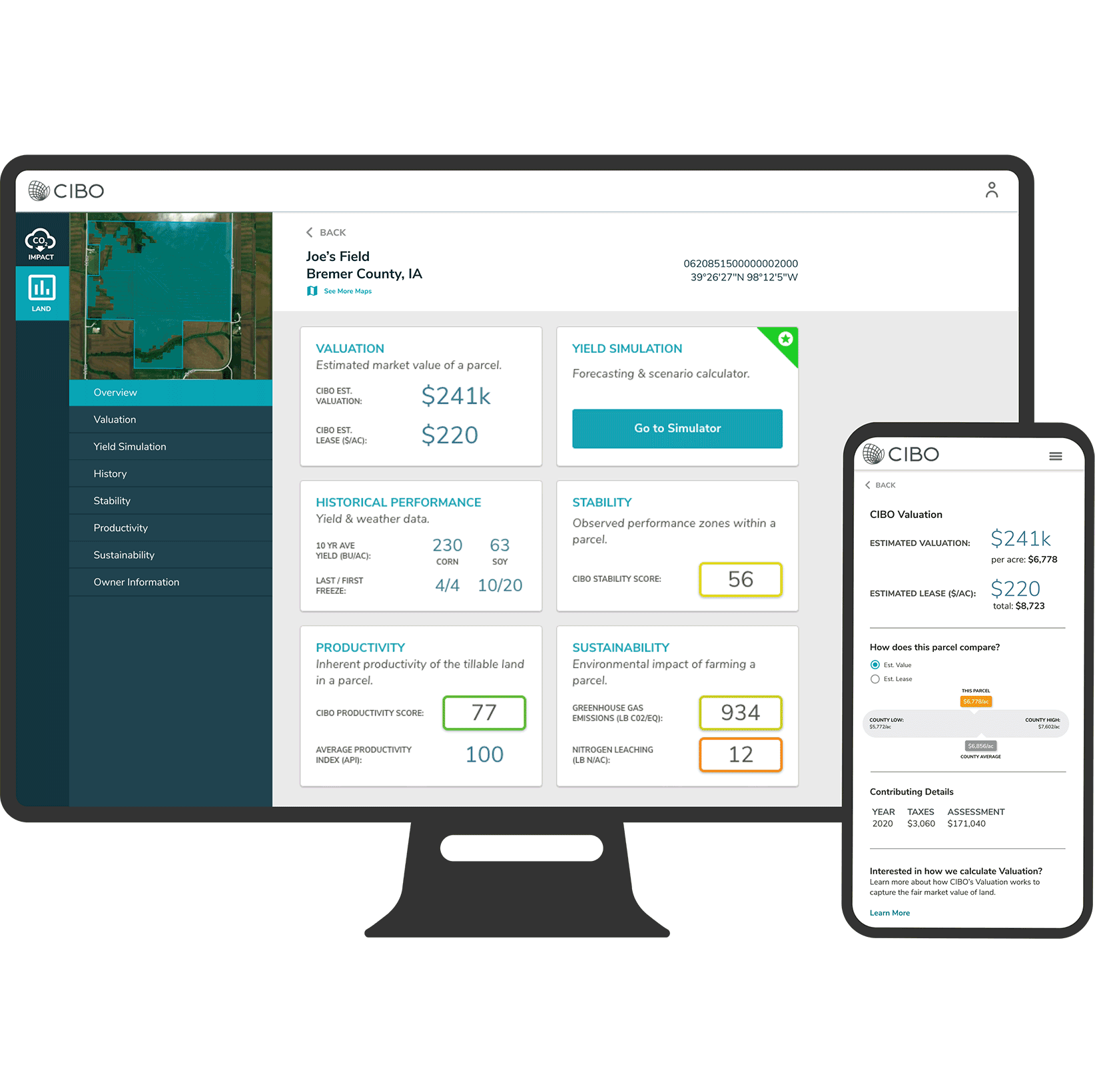
Relevant information is easy to find
The single report is restructured, based user priorities and groupings


Land insights are simple & digestible
Scoring system is simplified and hiding extra details makes for a more digestible interface.
Geospatial data is central to the UI
Geospatial data is connected to report sections, adding an interactive component to the report, bringing the metrics to life.

WHAT'S NEXT?
Like many startups, CIBO underwent a strategic shift over the months following this work, and our focus changed to building out an enterprise product. A version of this report, based on much of this exploration still exists today as part of CIBO's enterprise offerings.